


The Phillips Constellation
Issues with the Unemployment-Based Phillips Curve and Alternative Metrics

Disclaimer: I am not a trained economist, and am still in my formative stage of economics education. These are based on my research and are designed to invite discussion rather than prove a new economic theory. Criticism is welcome through either the comment section or my email: Eridpnc@gmail.com
Summary
Growing the economy requires utilizing more resources. When there are many resources available, slack is high and growing the economy doesn’t require large increases in the inflation rate. But with little available resources, there is little slack, so demand stimulus causes large increases in inflation.
The orthodox (unemployment-based) Phillips curve uses unemployment to measure slack, which is methodologically flawed.
Ideally, the Phillips curve measures the aggregate marginal price required for each business to produce an additional dollar of real GDP. While aggregate marginal price is accurate, it is nearly impossible to calculate.
Instead, policymakers can break down the marginal price into measurable parts, which reveals potential alternatives to unemployment.
How Does the Orthodox Phillips Curve Work?
Unemployment generally correlates with slack. When many people are out of work, there’s a good chance that some of those workers could be productive. However, when there is low slack in the labor market, economic growth causes more competition for workers and higher wages, driving up the cost of production and eventually prices.
Here is the historical correlation between inflation and unemployment:
Figure 1: US Unemployment Rate (bottom) and Inflation Rate (left) from Q2 1954 to Q1 2024
R-squared1 : 0.019 Slope: 0.19
Source: Federal Reserve Bank of St. Louis
At first, the data looks totally random. The slope is positive, so quarters with higher unemployment correlate with higher inflation, the exact opposite of how the Phillips curve is supposed to work! However, a breakdown of the data into separate time periods shows that unemployment as an indicator of slack has been valid at least sometimes:
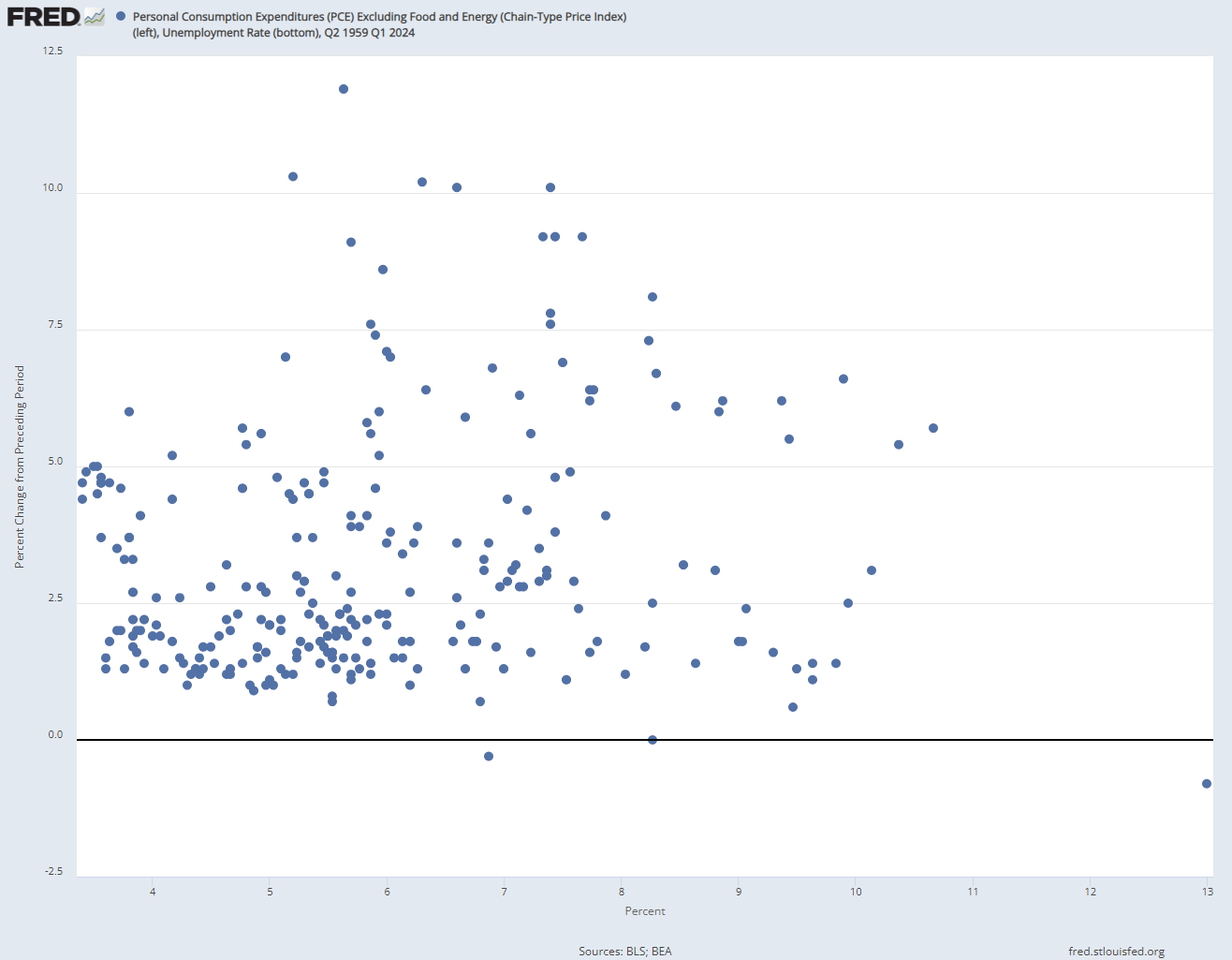
Figure 2: Phillips Curve By Time Period

Phillips Curve (1959-1970)

Phillips Curve (1970-1980)

Phillips Curve (1980-1990)
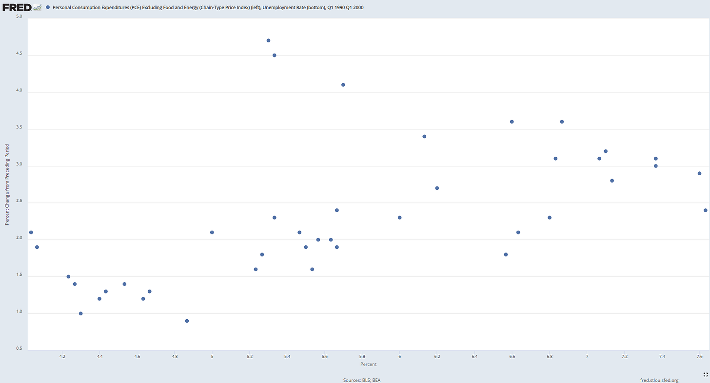
Phillips Curve (1990-2000)

Phillips Curve (2000-2010)
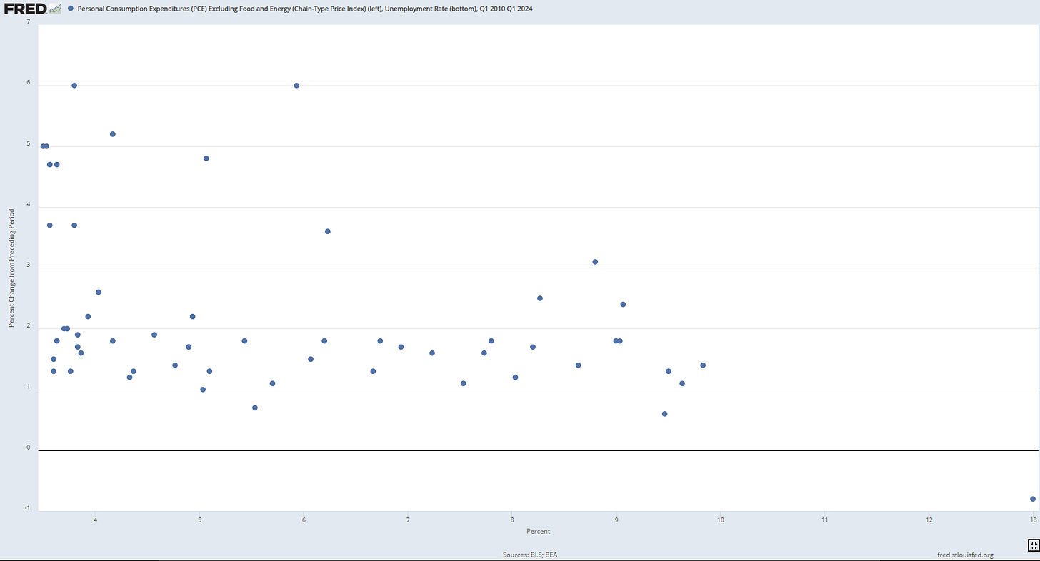
Phillips Curve (2010-2024)
Source: Federal Reserve Bank of St. Louis
Here’s the predictive strength of the data:
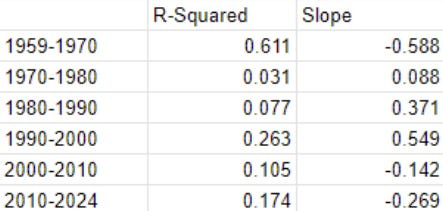
The strongest relationship was during the 60s, where more than 61% of inflation could be explained by changes in unemployment. After the 60s, the correlation breaks down and the slope becomes positive. Unemployment generally is an unreliable measure of slack today, with an r-squared value of 0.105 and 0.174 in the last two decades respectively.
There are major issues with unemployment as a measure of slack:
First: Unemployment doesn’t accurately represent labor market slack. The unemployment rate is as follows:
Unemployed people are formally defined as people actively searching for a job. If someone gives up looking for a job, the unemployment rate ironically goes down, indicating a reduction in slack. Additionally, during recessions, workers lose confidence in their ability to work, while extended periods of unemployment makes their resume look worse, making it more difficult to find a job.
These effects have led to drastically different rates of labor force participation, shown here:
Figure 3: Labor Force Participation Rates from 1948-2024

Source: Federal Reserve Bank of St. Louis
In the 1980s, the labor force participation rate went up greatly, which showed an increase in opportunity in the economy. However, these entrants were employed at a lower rate than the rest of the labor force, so the unemployment rate increased. This explains the positive slope for the Phillips curve during that decade.
Second, workers aren’t the only cost of production. For example, in the 1970s, the price of oil greatly increased, which increased the cost of electricity, shipping, transportation, and other key services. The increase in these costs of production spilled over to nearly every other good and service. As a result, companies responded by both increasing prices and laying off workers. This explains the positive slope for that decade.
Granted, the Phillips Curve can be shifted to account for different shifts in the cost of production or the labor market, but this requires separate tools to determine how much to shift the curve and where. However, this unnecessarily complicates the curve and makes it more difficult to use as a policy tool.
What’s the Ideal Phillips Curve?
The ideal Phillips curve measures the aggregate marginal price, which accounts for changes in the cost of all factors of production (wages, rent, profit, and interest). To account for these changes, the aggregate marginal price must predict what goods and services are demanded as a result of stimulus, and then calculate what price would be required for the most willing business to produce those. This models the required inflation for a business to produce an additional dollar’s worth of real GDP.
Marginal price is theoretically perfect because it includes every possible consideration businesses make before setting a price. A study from NYU used information from individual businesses to find their marginal cost and pricing decisions. When using this dataset, researchers found that the model was incredibly good at showing the inflationary effects of non-labor shocks such as increases in the price of oil.
However, it is impossible to aggregate the marginal price. Doing so requires accurately predicting both what consumers will buy as a result of stimulus, along with how efficiently businesses will meet this demand. This involves simulating trillions of decisions conditional on trillions of other decisions other actors take.
Faced with this problem, economists try to approximate the marginal price instead by breaking it down into different parts, including the cost of labor and the cost of non-labor resources.

There is a caveat to this: increases in labor scarcity can increase scarcity of other resources, as low unemployment signals that businesses are expanding. However, there are other causes of resource scarcity that are not from general expansion.
Estimating Marginal Price
New metrics have one of two goals:
Accurately measure the labor market: This includes JOLTS and U6
Measure all costs of production: This includes the PPI, IS Ratio, and the Output Gap
Job Openings (JOLTS)
Job Openings measure unmet labor demand. A high rate of job openings forces employers to increase wages to prevent their employees from leaving. Additionally, more job openings show that many businesses are expanding, which increases the use of resources, so general slack is low.
Figure 4: Inflation Rate (left), Job Openings: Total Nonfarm (bottom) from Q1 2001 to Q1 2024

R-Squared = 0.48
Source: Federal Reserve Bank of St. Louis
Job openings are currently the most reliable gauge of labor market slack. When there are many job openings, high inflation is almost guaranteed.
However, there are some issues with job openings. As Preston Mui, a Ph.D. in economics argues:
Job openings only count hiring through open vacancies, which has empirically ignored a substantial share of hiring.
Job openings fluctuate with job recruiting technology. For example, an advancement that makes it more convenient to list an opening would increase the openings rate without changing the actual willingness to hire, overestimating the decrease in slack.
There is no one labor market. When hiring in certain industries increases, it often has nothing to do with the amount of job openings in the general economy. One industry may have a high rate of labor turnover because it is quickly becoming obsolete.
Job openings, like unemployment, aren’t the end-all-be-all of slack indicators. However, they have higher predictive accuracy than unemployment and are resilient across the time they’ve been used.
Unemployment-6
U6 uses the same formula as normal unemployment but classifies two new types of people as unemployed:
Marginally Attached People: People who aren’t looking for work, but looked recently in the past and want work. This encompasses discouraged workers, who should be classified as spare capacity.
Total Employed Part Time for Economic Reasons: People who could not find full-time jobs, had their hours reduced, or work fewer than 35 hours per week due to business conditions. This measures potential excess productivity that businesses are giving up by not hiring for full hours. The rate of part-time work is also more sensitive to economic conditions, since reducing hours is a less committal decision than layoffs for businesses looking to cut costs.
Here’s the new data:
Figure 5: Inflation Rate (left) and U6 (bottom) by Time Period
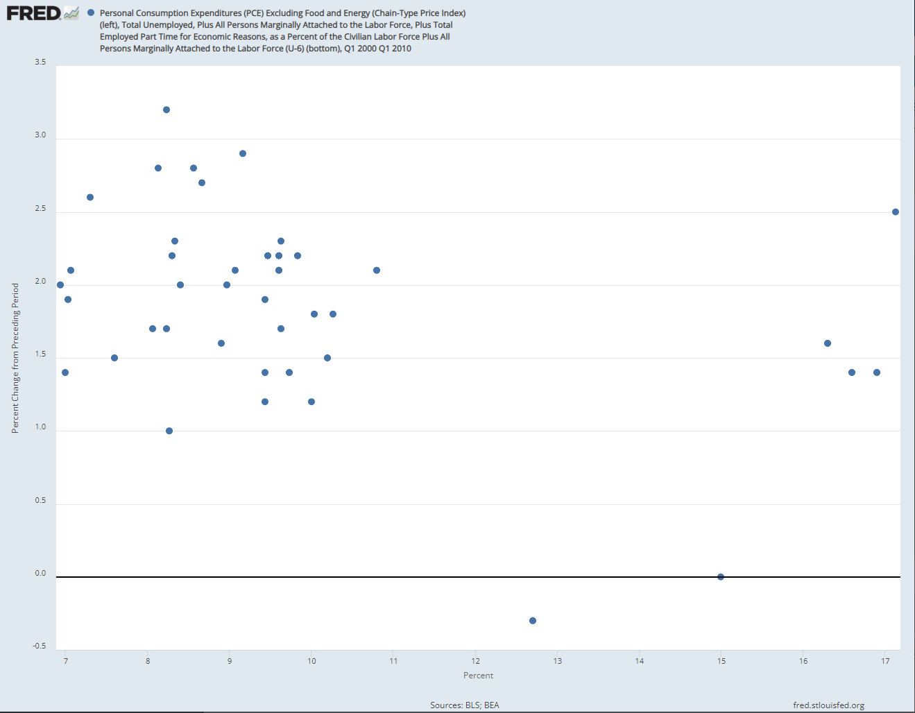
Q1 2000-Q1 2010
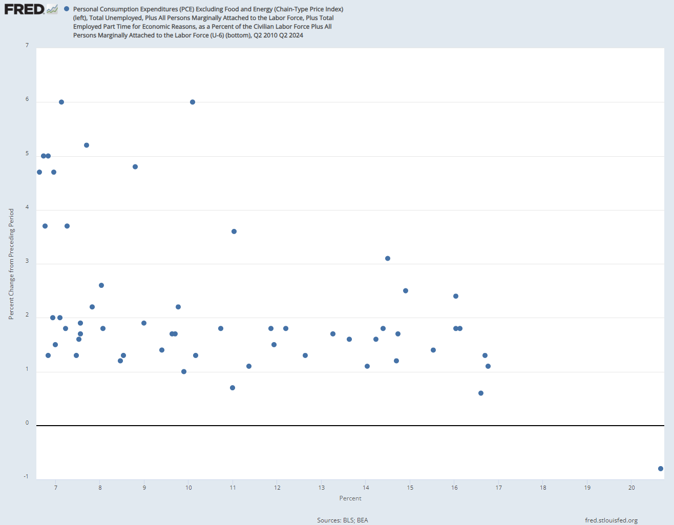
Q2 2010-Q2 2024
2000-2010—R-squared: 0.123 Slope: -0.088
2010-2024—R-squared: 0.222 Slope: -0.188
Source: Federal Reserve Bank of St. Louis
Both periods show a predictive value that is slightly stronger than unemployment, so the extra indicators are useful for measuring slack.
Output Gap
The output gap is calculated by:
Potential Real GDP - Actual Real GDP
It’s also known as capacity utilization, which is calculated by:
Actual Real GDP/Potential Real GDP
Potential real GDP is the amount of production given all resources are being utilized, so the output gap is the dollar value of production from all non-utilized resources. A large output gap indicates that many machines, workers, and/or land is not being utilized. If there is a large output gap,an increase in demand would prompt businesses to utilize this excess capacity, which is cheaper than building out new capacity. Since this form of production is cheaper, demand stimulus won’t cause a large increase in prices.
Here are a few of the many methods to calculate the output gap:
Natural Factor Output: This method is used by the Congressional Budget Office (CBO). It judges the size and quality of the labor force, using factors such as schooling, experience, and labor force participation. It then examines other inputs, such as capital (machines, tools, etc.). It sums the natural dollar-producing capability of all of these factors of production to yield the potential real GDP. Natural capability is defined as the amount that a resource would likely generate if it was used. For example, the natural capability of a worker is 40 hours per week, even if it is physically possible for them to work more.
Compound Indices: A study from the European Central Bank found the best predictor for the output gap included 7 fundamental economic variables (Past inflation, long-term inflation expectations, real GDP, real private investment, real imports, real exports, unemployment rate, capacity utilization measured by a survey, and consumer confidence), and a random change to all real economic variables for the future.
Figure 6: Inflation (left) and Time (bottom).
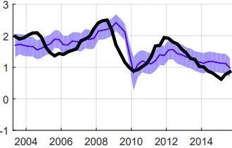
Source: European Central Bank
Since the variables are randomized in the model, the authors used the 16th percentile and the 84th percentile projection of the model (purple area), the median prediction (blue line), and the actual inflation rate (black line). The model exclusively predicted the inflation 1 year from the latest data release.
One issue with the output gap is that adjustment in the marginal cost is subject to lags. When resources become plentiful and slack increases, it takes a while for the prices of these resources to go down.
By measuring current levels of investment and capacity utilization, this model is able to gauge how much the marginal cost has adjusted. Additionally, most models assume that costs require time to adjust when predicting the future.
Inventory to Sales Ratio (IS Ratio)
Inventory is the total amount of goods and services produced but not sold. When inventories in comparison to sales are high, there are many excess goods and companies will lower prices. When they are low, there is little slack in the economy and increased demand will likely cause higher prices.
Inventories also signal what companies are currently deciding. When inventories are low, companies are already trying to maximize efficiency and expand production, while high inventories mean that they are considering lowering production in the future.
This metric shows excess supply across the economy. If average inventory is high, stimulative policy will cause a drawdown in inventory, which reduces the inflationary effect.
However, there is a scenario where companies have the capacity to produce cheaply, but choose not to. In this case, stimulative policy would be correct, as the increase in demand would cause producers to meet the demand without a substantial change in the price level. This happens frequently during recoveries from recessions, where spare capacity is being put to use.
Figure 7: Percent Change in Total Business: Inventories to Sales Ratio, seasonally adjusted (ISRATIO) (left) and Inflation Rate (bottom)

Q1 2000-Q1 2010

Q2 2010-Q1 2024
2000-2010—R-squared: 0.290 Slope: -5.913
2010-2024—R-squared: 0.072 Slope: -5.89
Source: Federal Reserve Bank of St. Louis
Unlike labor indicators, which have better predictive value from 2010-2024, the IS ratio is better from 2000-2010. This suggests that inflation from 2000-2010 was due more to non-labor costs, while inflation from 2010-2024 was due more to labor costs.
The difference in effectiveness provesthe utility of multiple slack indicators. If there are enough goods stored away, producers can withstand a small increase in the cost of production. In this scenario, stimulating the economy will not cause substantial inflation. This is proven by consistently low inflation rates at high IS ratios.
Producer Price Index (PPI)
The PPI is the cost of a basket of various goods commonly used to produce goods in the economy. Common services include accounting, energy, transportation, and warehousing. Common intermediate products include car parts for car companies and gasoline for trucking companies.
The method for calculating PPI has changed a lot, as the basket must be updated as businesses adjust the amount of types of products they use for production. Historically, the PPI and CPI were very closely related until the 2000s, when globalization enabled the United States to import when production costs increased.
In 2014, the Bureau of Labor Statistics released a new method for calculating PPI, accounting for a larger portion of US production. New studies from this method found that the PPI and CPI do adjust towards each other in the long-run. This suggests that a short-run PPI larger than the CPI makes long-term PPI disinflation or CPI inflation likely.
Here’s the data:
Figure 8: Inflation Rate (left) and Inflation of the PPI of Processed Goods and Services for Intermediate Demand from 2010-2024

R-squared: 0.403 Slope: 0.303
Source: Federal Reserve Bank of St. Louis
These data are good for predicting inflation by measuring the whole cost of production. The PPI can act as an advanced warning of future inflation since there is a lag between the cost of production increasing and businesses increasing prices. A PPI that is lower than the CPI shows an increase in slack, as the average revenue has increased relative to the average cost of production, so average profit (and ability to expand production) has increased.
Conclusion
The Phillips curve is a tool used to show how stimulative or contractionary policies will affect the economy. It measures slack, which isthe amount of inefficiency in the economy. However, the correlation between unemployment and slack has recently broken down.
The ideal Phillips curve uses aggregate marginal price, which accurately predicts the future effects of policies on the price level. To approximate marginal price, economists try to find metrics that can detect changes in the cost of production or pricing strategy. Some of these metrics include the output gap, IS ratio, PPI, U6, and job openings, which either measure labor market slack better or encompass a larger portion of the costs of production. These indicators have better predictive value than unemployment, and are therefore more useful for measuring slack.
R-squared is the predictive value of a dataset ranging from 0 to 1. At 0, there is no correlation and variation in one variable explains 0% of variation in the other variable. At 1, all variation in one variable can be explained by variation in the other.